Did you catch wind of one of the latest Google product releases?
In May, Google announced Data Studio – their free, data visualization product (free version of Data Studio 360). And we are in love!
What is Google Data Studio and what can I use it for?
Simply stated, Google Data Studio is Google’s latest product release of their reporting and data visualization tool. No, it’s not part of the Google Analytics evolution. Instead, it’s a separate product that makes it easy to create custom reports using connected data sources. This new tool allows you to bring together sources of data and create visually appealing, dynamic reports. With these new reports you can tell a great story for your company and/or your clients.
“One of the fundamental ideas behind Data Studio is that data should be easily accessible to anyone in an organization. We believe that as more people have access to data, better decisions will be made,” writes Google in a blog entry.
The team at Volume Nine couldn’t agree more! Data is power, especially when it comes to SEO and online marketing strategy.
What I also love about this new tool is it allows you to combine data across multiple sources into one dashboard – yes, you read that correctly! For example, I can create a report that contains information from Google Analytics (All Sessions, Organic Sessions, Conversions, etc.), in addition to my data from Google AdWords. It even allows me to bring multiple Google Analytics accounts into one place, and share data with non-Google Analytics users.
Where should I start?
When you create and log into your Data Studio account (should be the same login you use for Google Analytics), the first thing I suggest doing is going through the awesome interactive walkthrough Google provides. The walkthrough is called “Welcome to Data Studio (Start Here)” from the list of reports in your account. I skipped this at first and tried to jump right in and immediately regretted it.
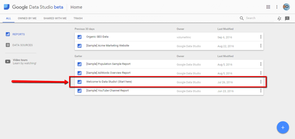
Don’t pass up the free tutorial directly from Google! After you go through it, you can then poke around, connect your data sources, and explore the Data Studio Help Center for more advanced questions and topics.
What data sources can I connect?
Google Data Studio can pull data from a variety of sources, including the ones listed below. The good news is Google is always working on adding new data connectors.
- Google Analytics
- Google AdWords
- YouTube
- BigQuery
- Attribution 360
- Google Cloud SQL
- MySQL databases
- Google Sheets imports
How do I connect data sources?
Adding data sources is very easy… and it’s just as easy to then add them to your reports. Below are the steps for adding Google Analytics to your Data Studio account.
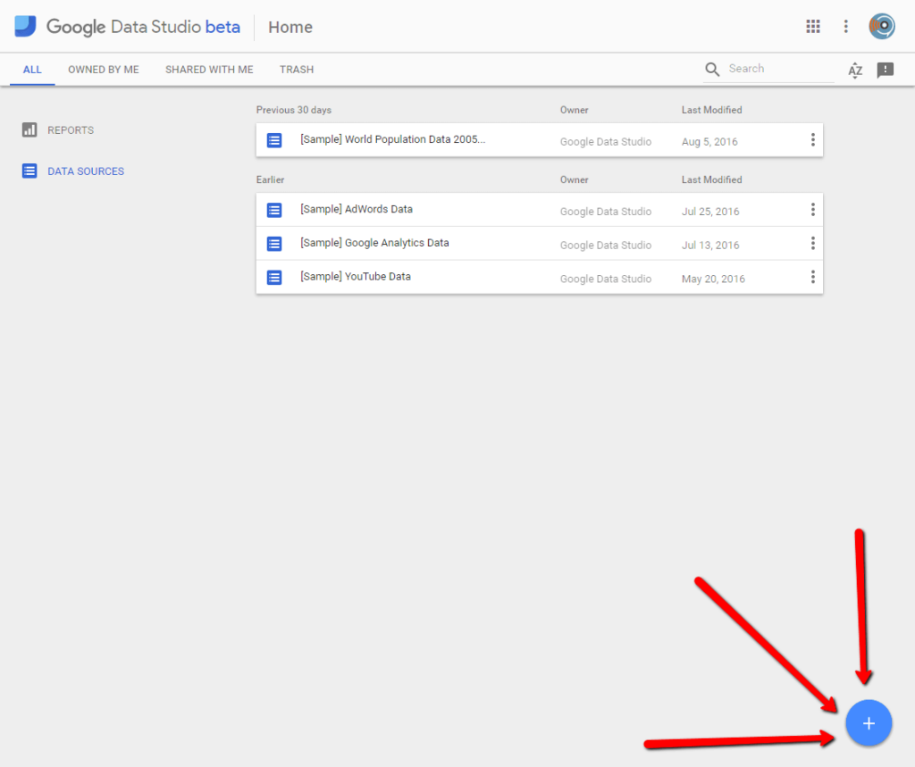
(1) Navigate to the “Data Sources” tab within Data Studio.
(2) Click the big, blue plus button in the bottom-right corner of your screen.
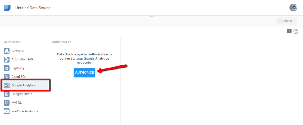
(3) From there, the configuration panel will open up. Click on “Google Analytics” or whatever data sources you are going to add.
(4) Click the blue “Authorize” button. This will prompt a pop-up asking for permissions – click “Allow”.
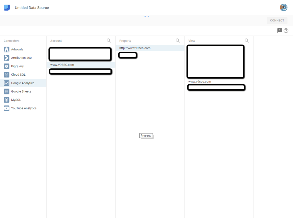
(5) Select the correct GA Account, Property, and View. Making sure you select the right ones is essential because this is what creates your data set!
(6) Click “Connect” in the upper-right. This prompts another panel to open that contains all your dimensions and metrics allowing you to fine-tune your data set (i.e. renaming, disabling, etc. certain fields).
(7) Rename the data source, if needed. The default name matches the View name from Google Analytics.
(8) Click “Create Report” in the upper-right to start building your first report! If you plan on adding more data sources before you start your report, click “Create Report” and leave the report blank to come back to later. Or, if you’re not ready to create a report, simply click the blue Data Studio logo in the upper-left corner. Then start from step 1 above for your new data source.

If you made a boo-boo, it’s very easy to remove a data source. From the “Data Sources” tab, click the three dots on right side in the same row as your data source and select “Remove”. Once this action is complete, charts/graphs using this data will no longer work.
How do I build a report?
After your data sources have been added, click the “Reports” tab. If you already started a report when adding data sources it will be called “Untitled Report”. Start here. Or, if you need to make a new one, click the big, blue plus button in the bottom-right corner. From there, you’ll be prompted to add your first data source – click on your data set and confirm by clicking “Add to Report”.
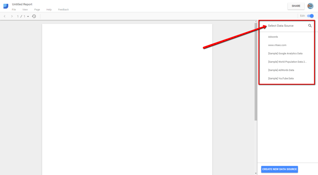
Awesome! Now we can start visualizing your data. Within Data Studio, click on the button for the type of chart you want to add, then use your mouse to draw the chart in the space you want it. The next step is to edit your Dimensions and Metrics, add filters (see more below), and style it. Each chart can be dragged and moved around the report to customize your layout.
It is important to note that, with the free version of Data Studio (i.e. if you’re not paying for Data Studio 360), you can build up to five reports. The good news is you get unlimited sharing, editing, and collaboration for each of those five reports!
What types of charts and graphs can I add to my report?
The sky is the limit on this! Once you connect your data sources, you can pull data from any of the sources directly into your custom report.
Trend / Line charts – Show performance or stats over time to illustrate drops, spikes or plateaus in data.
Scorecards – Overall stats to show data at a glance.
Tables – These are best used to represent data in a detailed way.
Bar charts
Pie charts
Geographical representations – These show where your users are located.
Bullet charts – These can help portray progress towards a certain goal or KPI.
Ecommerce – Being able to see your ecommerce data in a visually appealing manner is invaluable. Data Studio allows you to create reports that pull in data from a 3,000-foot level such as monthly revenue, down to the micro level such as products added to the shopping cart or revenue per product. See my sample report below for ideas on how to visualize your ecommerce data!
How do I add more than one data source to my Data Studio report?
Great question! This took some figuring out. From your report, select and add the type of graph or chart you want to add. Then from the “Properties” panel navigate to “Data Source” and click the small arrow (seen below). Click on your data set of choice, then “Add to Report”. If it’s already been added to the report, this pop-up will not happen it will simply change the Data Source for you.

My Favorite Features
Below are some features and functionality items that you shouldn’t miss in your Data Studio reports to make them even better.
Filters
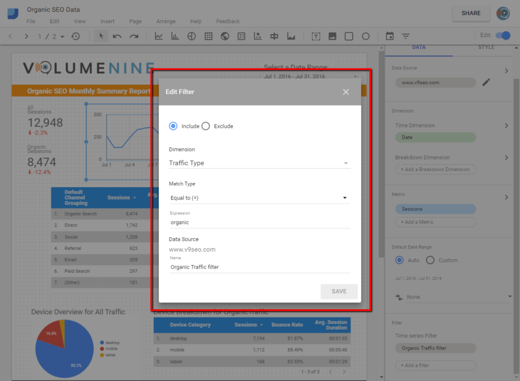
In my Data Studio reports, I use filters primarily to show just organic data for charts such as time series,scorecards, or tables. To add a filter to your chart, click on your chart and go to the Data tab. Scroll all the way to the bottom and click “Add a filter” under the filter section. In the pop-up, fill out the appropriate circumstances. For example, to get organic sessions in my timeline I set up the following filter…
Date Ranges & Data Controls
Google allows you to add interactive data controls, such as a date picker and dynamic filters. Both of these enable report editors to make reports interactive for viewers. In other words, from a shared report, a viewer can change the date range of data they are looking at to compare and contrast! These functionality pieces are called “Date Range” and “Filter Control” under the insert menu/menu bar. A date range looks something like this in a final, shared report…

Compare Date Ranges
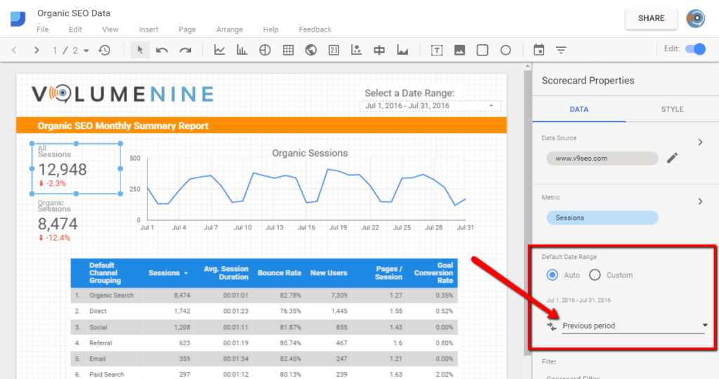
Sometimes, the most valuable information is illustrated by comparing month-over-month or year-over-year data. Thankfully this can be set up via Data Studio under the “Default Date Range” section for your chart. I love doing this for timeline series graphs and scorecards. For example, to get a month-over-month comparison for my All Sessions data I set up the “Date Compare Type” settings…
Styling Your Report
Each report, graph, chart, table, etc. can be stylized to match your company or client’s branding guidelines. To edit the style of each chart or graph, click on it, then go to the “Style” tab and edit your font color or size, line color(s), alignment and more. You can also add company logos and text boxes to add more custom elements to the report (as seen in the example report provided below).
Sharing Reports
After you create and finalize your masterpiece, it’s time to brag about it and show your co-workers the report. Google Data Studio allows you to share your report very easily. This functionality acts just like it would in Google Docs. From your report screen, click “Share” in the upper-right corner and select the settings of your choice.
Example Data Studio Report for Organic SEO
Hopefully my tips and tricks, example graphs and charts, and favorite features above will help you get a feeling for the data and the power behind Google Data Studio. You can also take a look at my example reports…
Happy visualizing!
