Including calls to action (CTAs) on your website and blog is essential in driving users down the funnel to a sale. An effective CTA (call to action) can vary from page to page and also from platform to platform. In this article, we’ll take a look at some great real-life call to action examples and note tips and tricks for maximizing these actions, as well as how you can use tools to test and pick winning CTAs.
1.Tesla covers all their bases with 4 CTA buttons
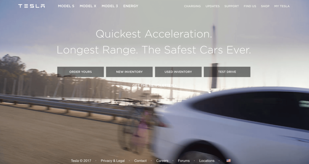
Tesla gets right to the point and asks you to order your Tesla today with the “Order Yours” button, but also has three additional CTA buttons for you to make a choice. Remember, your audiences can be coming to your site wanting different experiences. Tesla knows this, and their landing page CTAs reflect this.
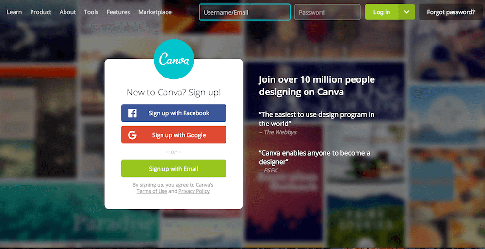
2. Canva makes it easy to sign up with an account you already have
Canva makes it easy for people to complete the call to action by integrating with Facebook and Google. Almost everyone has a Facebook or Google account, and in the case that you don’t, you can still get an account with your email.
One important tip to note, when marketing your product or service B2C, is to make sure to open up your sign-up form by allowing non-business email addresses or personal email addresses as well.
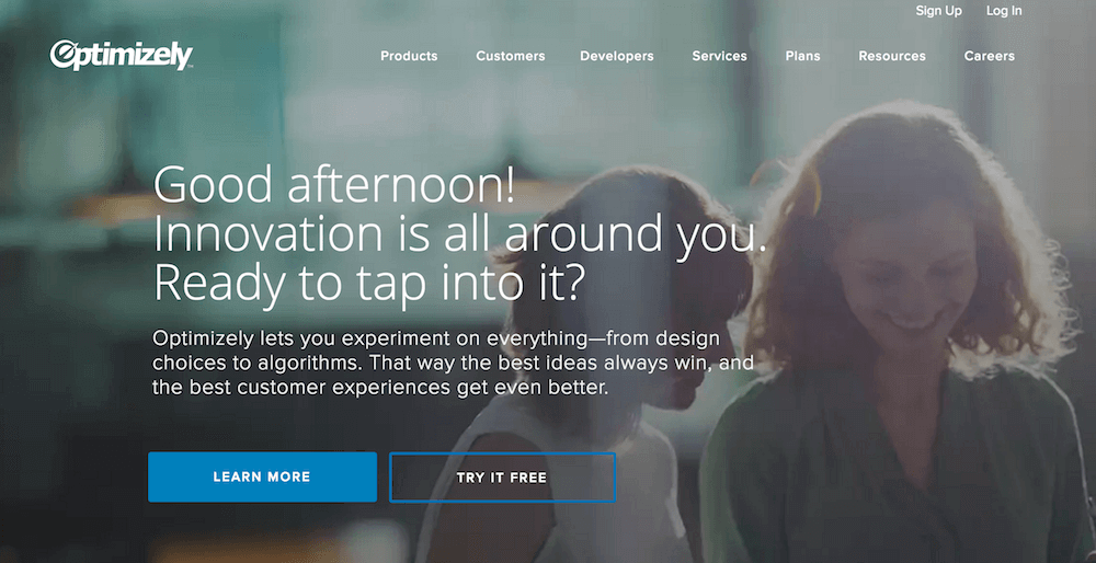
3. Optimizely entices you with a free 30-day trial
Optimizely, a software that helps you optimize your website, offers a “Try it free” call to action, above the fold on their main landing page. Free is a powerful word in marketing, and one that you should use in your CTAs if you can!
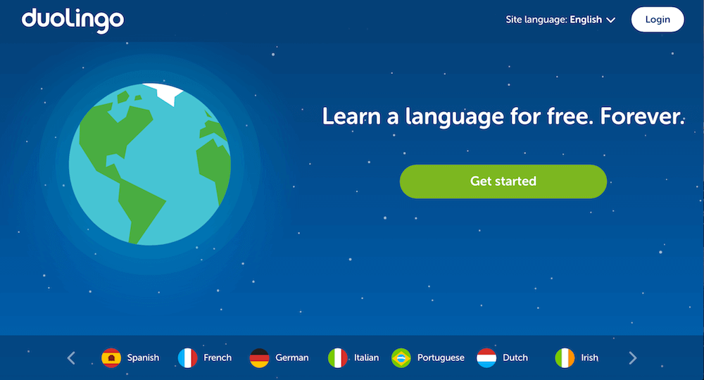
4. Duolingo lets you get started before even signing up
Duolingo is a unique example of great B2C marketing because their CTA hooks you on the product and then later asks you to create an account after you’ve tested it out. Using a “Get Started” CTA and really meaning it is something powerful and special.
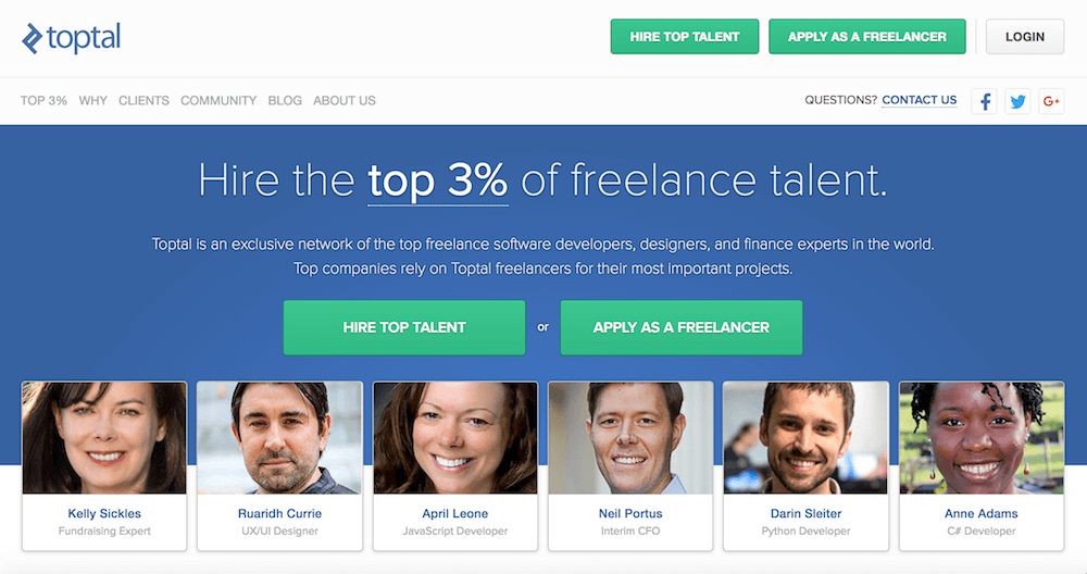
5. Toptal knows it has exactly two types of audiences
Toptal knows its audience is split into two diverse groups, so their call to action buttons reflect their target audiences as well.
6. Robinhood asks if you want to join the team at the end of their posts
Talk about mixing it up. Robinhood doesn’t just ask you to like or tweet – they also ask you every post if you’re interested in joining the team.
7. HubSpot wants to you consume more content
The HubSpot blog uses a few different call to action tactics on their blog. They use a large CTA banner to direct readers to other resources, as well as an in-article link near the end of the post to direct you to another blog post.
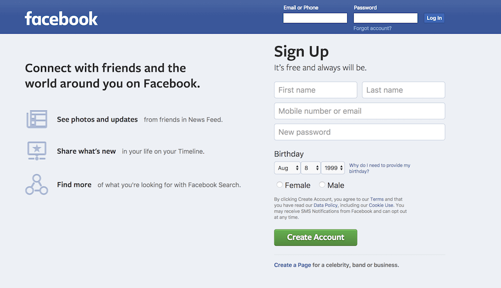
8. Facebook departs from their brand colors to make their CTA pop
Sparingly using a color that doesn’t represent your brand can draw the eye to specific parts of the page. Facebook’s sign-up page illustrates how this can be done effectively without compromising the look and feel of your brand.
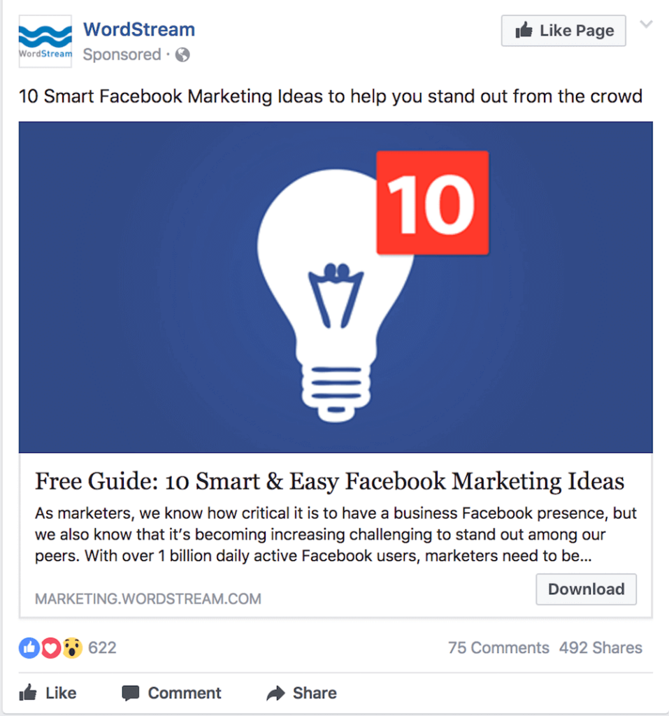
9. Wordstream stands out from the Facebook ad crowd with different copy on the CTA button
Many Facebook ads use the same language in their call to action, such as “Learn more” or “Sign up.” Mix it up if you want to stand out from the crowd, like Wordstream did with this Facebook ad.
How do you know if your call to action is effective?
An effective CTA will have a high conversion rate. You can track your conversation rates with a number of different tools such as Optimizely or Hubspot. With these tools, you can also test and measure how well different types of CTAs could perform using A/B variant testing. Looking for more help optimizing your website’s CTAs? Reach out to our SEO team – we’re here to help!
